BEFORE
Too many competing cues.
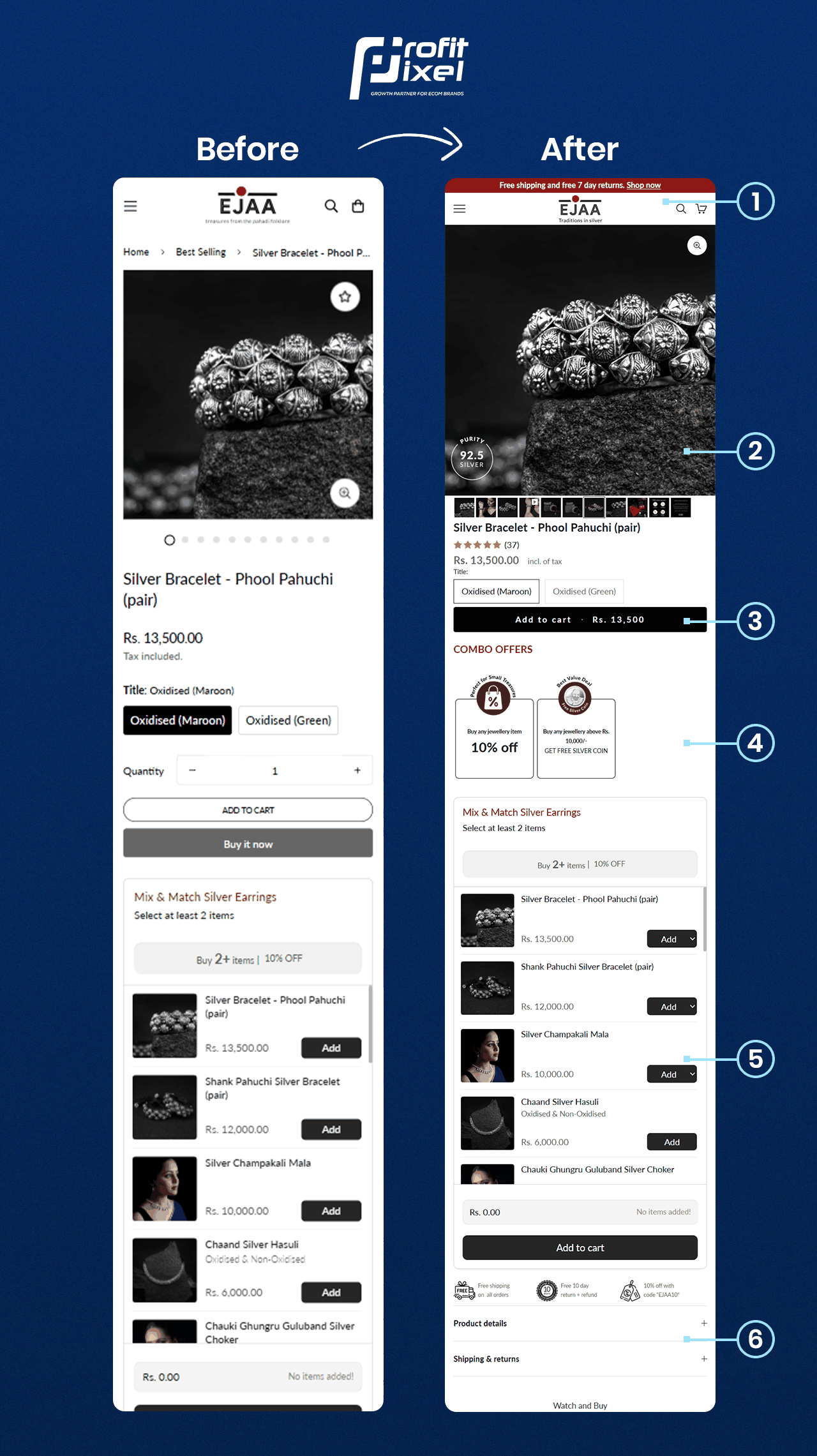
Variants, related products and the primary purchase action were tightly stacked. Optional additions competed with the main product decision.

A jewellery product page redesign that gave the main item, proof and optional additions a clearer hierarchy.
Real product-page layout comparison
THE PAGE STORY
The comparison focuses on changes visible in the product-page layout.
BEFORE
Variants, related products and the primary purchase action were tightly stacked. Optional additions competed with the main product decision.
AFTER
The revised layout makes the primary item and optional additions easier to distinguish within the buying flow. The image below shows the visible before-and-after changes.
WHAT CHANGED
These observations are based on the published before-and-after comparison.
Made product media and purity proof more prominent in the page layout.
Aligned variants, price and the primary Add to Cart action around the core product decision.
Reframed combo offers as a clearer optional addition rather than a competing primary action.
THE VISUAL EVIDENCE
Open the full-resolution image to inspect the layout details.
The images document visible page-design changes. Comparable analytics would be required to calculate conversion-rate or revenue uplift, and no such uplift is claimed here.
YOUR STORE, NEXT
Explore how ProfitPixel researches, prioritises and improves ecommerce buying journeys.