BEFORE
Too many competing cues.
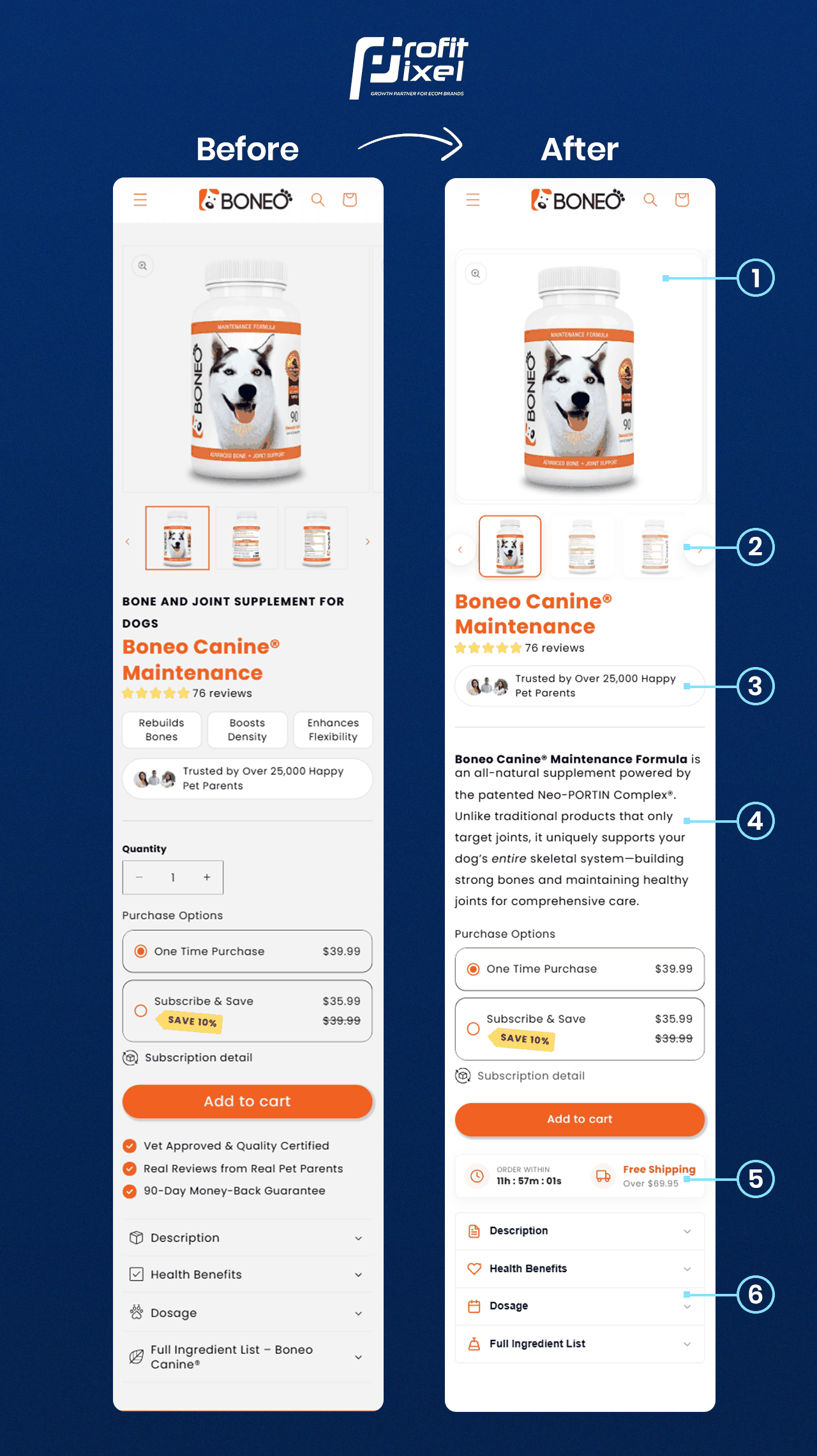
Product details, reassurance and one-time versus subscription choices competed for attention near the buying action.

A product page redesign that brought benefits, trust cues and buying options into a more deliberate sequence.
Real product-page layout comparison
THE PAGE STORY
The comparison focuses on changes visible in the product-page layout.
BEFORE
Product details, reassurance and one-time versus subscription choices competed for attention near the buying action.
AFTER
The updated layout presents the product story, proof and purchase options as a clearer sequence. The image below documents the visible before-and-after changes.
WHAT CHANGED
These observations are based on the published before-and-after comparison.
Rebalanced the product gallery and thumbnail navigation so shoppers could inspect the product more easily.
Brought reviews, benefit copy and customer reassurance higher in the product-page flow.
Placed one-time and subscription choices, delivery details and the primary Add to Cart action in a clearer hierarchy.
THE VISUAL EVIDENCE
Open the full-resolution image to inspect the layout details.
The images document visible page-design changes. Comparable analytics would be required to calculate conversion-rate or revenue uplift, and no such uplift is claimed here.
YOUR STORE, NEXT
Explore how ProfitPixel researches, prioritises and improves ecommerce buying journeys.