BEFORE
Too many competing cues.
Pricing, product details and purchase controls were visually fragmented on mobile. The main choice and next action were harder to connect.

A mobile product page redesign that made price, product reassurance and the purchase action easier to scan together.
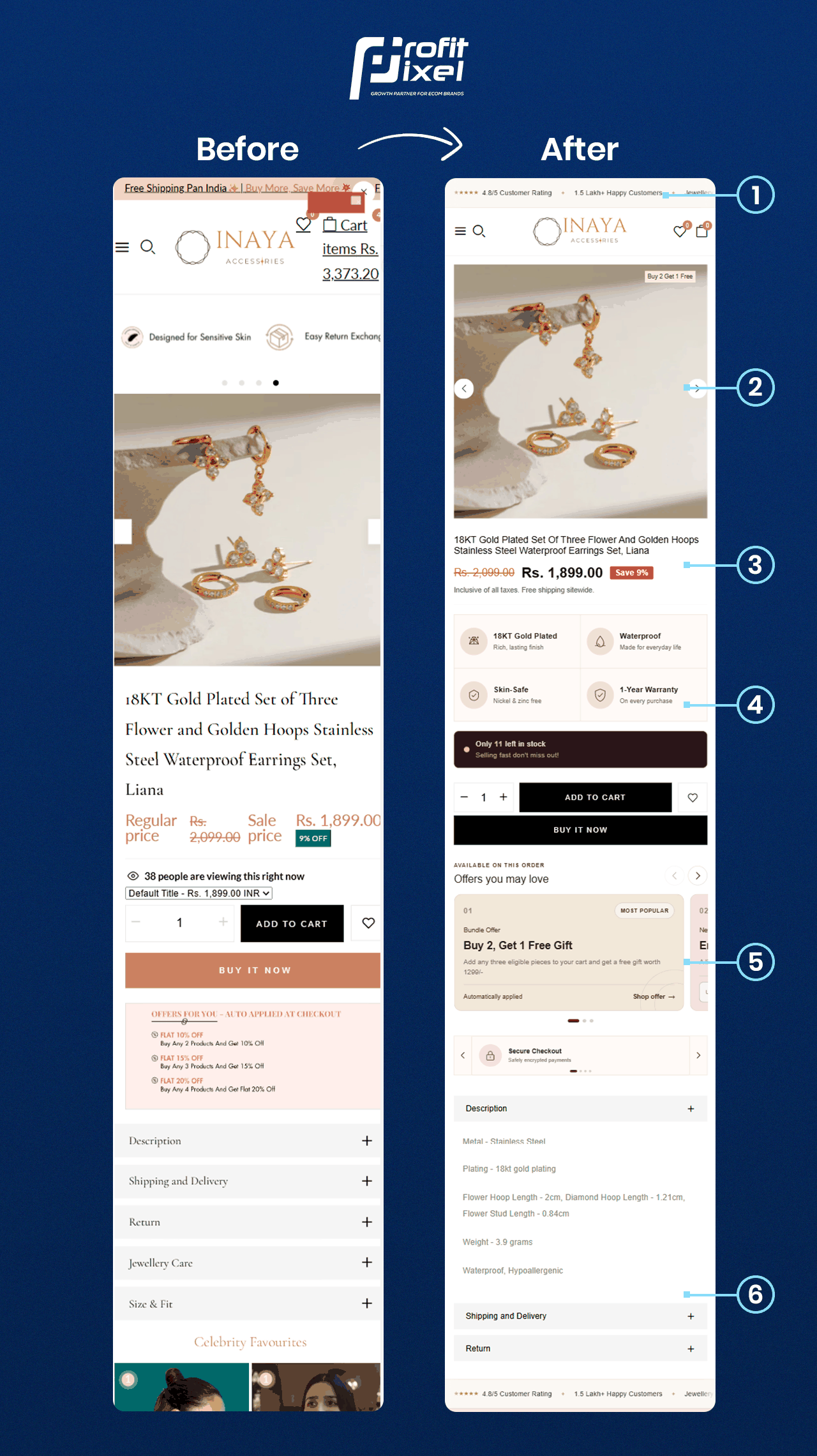
Real product-page layout comparison
THE PAGE STORY
The comparison focuses on changes visible in the product-page layout.
BEFORE
Pricing, product details and purchase controls were visually fragmented on mobile. The main choice and next action were harder to connect.
AFTER
The revised mobile layout places the core product choice and buying action on a more direct path, with product details close by. The comparison documents the visible changes.
WHAT CHANGED
These observations are based on the published before-and-after comparison.
Reordered the hero image, offer, benefits and action to give the mobile page a clearer opening.
Made pricing, materials and warranty information easier to find and compare.
Strengthened the visibility of the product choice and Add to Cart action alongside supporting details.
THE VISUAL EVIDENCE
Open the full-resolution image to inspect the layout details.
The images document visible page-design changes. Comparable analytics would be required to calculate conversion-rate or revenue uplift, and no such uplift is claimed here.
YOUR STORE, NEXT
Explore how ProfitPixel researches, prioritises and improves ecommerce buying journeys.